
timeFRAMe
Sep 22 — Nov 23
Role
Senior Product Designer
Responsibilities
End-to-end product design, from early exploration to developer handoff
Conducted usability testing sessions to validate design decisions across iterations
Ensured experience consistency across all product contexts
Designed the logo and visual identity of the product
GOAL
For the MVP, the scope was narrowed to the brewing process

Project protected by NDA
The company's name, logo and colors were changed, and research information was removed.
constraints
The number of future contexts was undefined at the start, meaning every design decision had to account for use cases that didn't exist yet
Operators work on the factory floor, on shared terminals, under time pressure, leaving little room for complex navigation or steep learning curves
The system had to be consistent across contexts with fundamentally different data structures and user mental models
MY APPROACH
Reviewed all user journey research produced by the service designer to build domain knowledge before touching any screen
Immersed in the full brewing production process (with a focus on the MVP scope) to understand operator mental models and real workflow constraints
Aligned with PM and Engineering on technical and business constraints to ensure design decisions were grounded in what was actually feasible for the MVP
Ran multiple ideation rounds, exploring layout patterns capable of handling high data density across contexts with fundamentally different structures and user mental models

I always start sketching with pen and paper. This gives me freedom and speed to put the ideas out.

Our brain is faster than our hands. Sketching with pen and paper helps to decrease this gap.

First design approach.
USABILITY TESTING INSIGHTS FROM FIRST DESIGN APPROACH
❌ Problem
Table list with low affordance. Due to the Design System frontend limitations, the only way to access the downtime details was clicking on the first row cell text.
They tried to click on the tags and row to access downtime details.
✅ Solution
Explore components with better click affordance than the table list.
❌ Problem
Tags labeling was confusing. The users thought ”Complete” meant the downtime was done, and ”Pending” wasn't clear (pending of what?).
✅ Solution
Change the tags to ”Uncategorized” and ”Categorized”.

Explored a card grid layout, but discarded it because operators lose sequential order reference, which is critical during an active brewing process.
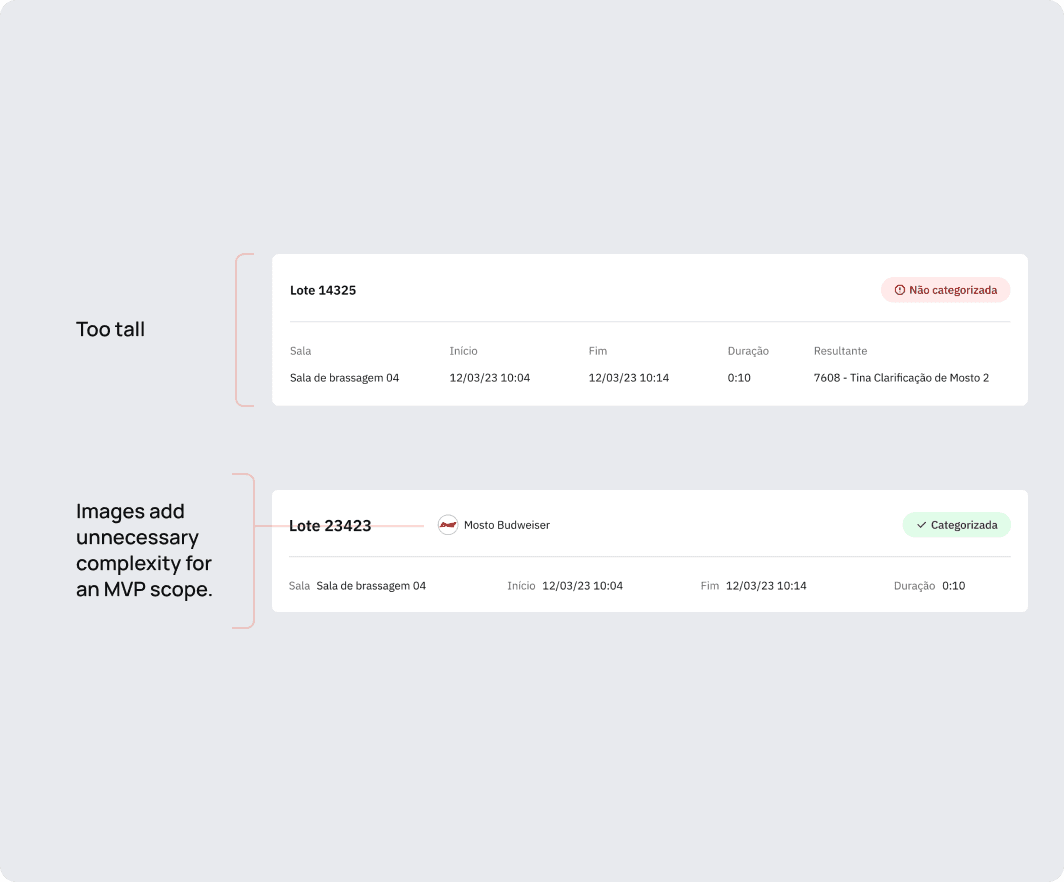
Tried a more complex card structure, but the lack of visual alignment distributed content unevenly across the layout, increasing cognitive load.
nothing was working, so i thought...
Yes, I just came up with this name. Who are you to judge me?!

Now the users have everything they need: a list and content alignment. HA! HA! HA! (evil laugh).

Look how beautiful it is. Everything is so aligned.

And so clean, and minimalist. But yet so efficient. I'm proud of you, table carded list.


results
MVP Launch
Downtime Categorization
Global Expansion

After launch, the product's visual identity was updated and new operational contexts were onboarded as the platform expanded.
WHAT CAME NEXT