timeFRAMe
Nov 23— Oct 24
Role
Senior Product Designer
Responsibilities
Led the navigation improvement study from problem identification to design system approval
Conducted internal and external benchmark research to inform structural decisions
Explored and iterated on navigation patterns compatible with an undefined number of future contexts
Collaborated with a Senior Product Designer to accelerate exploration
Ensured all solutions were built within the global design system token constraints
GOAL

Project protected by NDA
The company's name, logo and colors were changed, and research information was removed.
constraints
All design decisions had to use the global design system tokens, meaning structural changes had to work within established component boundaries
The number of future contexts was undefined, so the new navigation had to accommodate hierarchies that didn't exist yet
MY APPROACH
Initiated and led the navigation improvement study, identifying the split pattern as the core usability problem. The existing navigation divided first and second levels across header and left panel, a structure research shows increases cognitive load and reduces comprehension
Conducted internal and external benchmark. Internally mapping how many navigation levels each existing product relied on, and externally drawing inspiration from SaaS platforms with complex hierarchies
Collaborated with another Senior Product Designer to accelerate exploration and cover more directions in parallel, ensuring all solutions remained within design system constraints to enable adoption beyond the product
The left panel was only accessible through the burger menu, adding an unnecessary interaction step to reach secondary navigation.

Top navigation limits the number of items it can accommodate without breaking the layout.
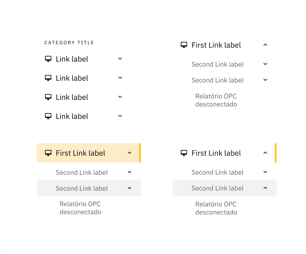
The left panel did not support nested items, restricting hierarchy depth.
The design system did not allow actions on the right side of the heading component, leaving that space unused despite its potential.
Combining the header and heading pushed the component to 284px height, consuming too much vertical space.
The first folder left too little room for content display.
LET THE EXPLORATION BEGIN


After applying it to a real scenario, I discarded this approach for two reasons: additional hierarchy levels would force the component to grow wider, and the side panel was already consuming too much visual space, leaving insufficient room for content.
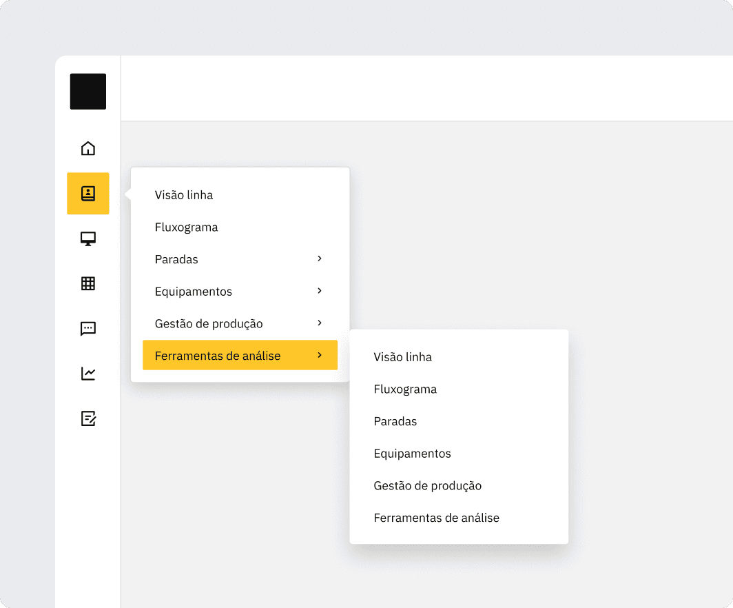
Tested the same navigation pattern used by Figma, but discarded it because products with multiple hierarchy levels would generate too many floating panels on screen, creating visual clutter.

Explored a Teams-like navigation with a collapsible second level, but the panel still made the component wider than previous approaches, contradicting the goal of preserving content space.

Different versions of the header. Finding a way to group and give meaning to each section proved to be a challenge.
Houston, we have a solution
results
Vertical Space
Global Navigation
Layout Stability
Usability Success
Implemented by Design Ops
WHAT CAME NEXT
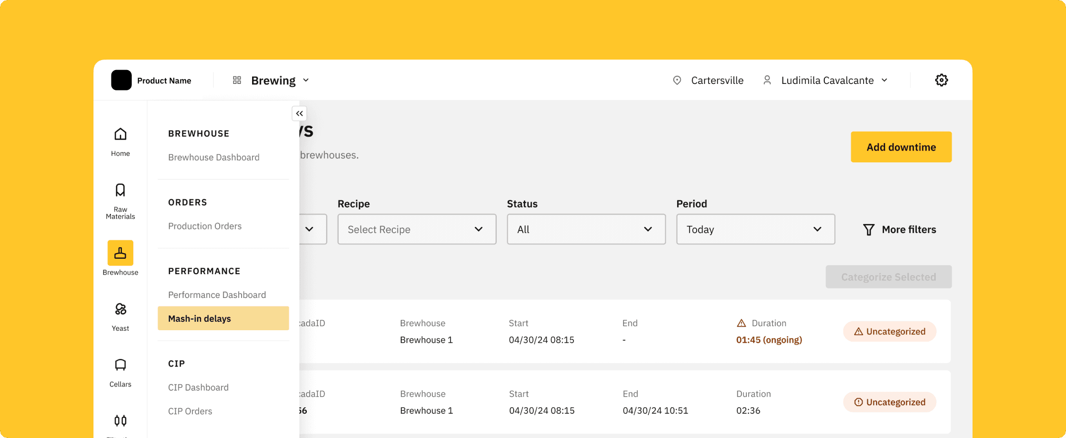
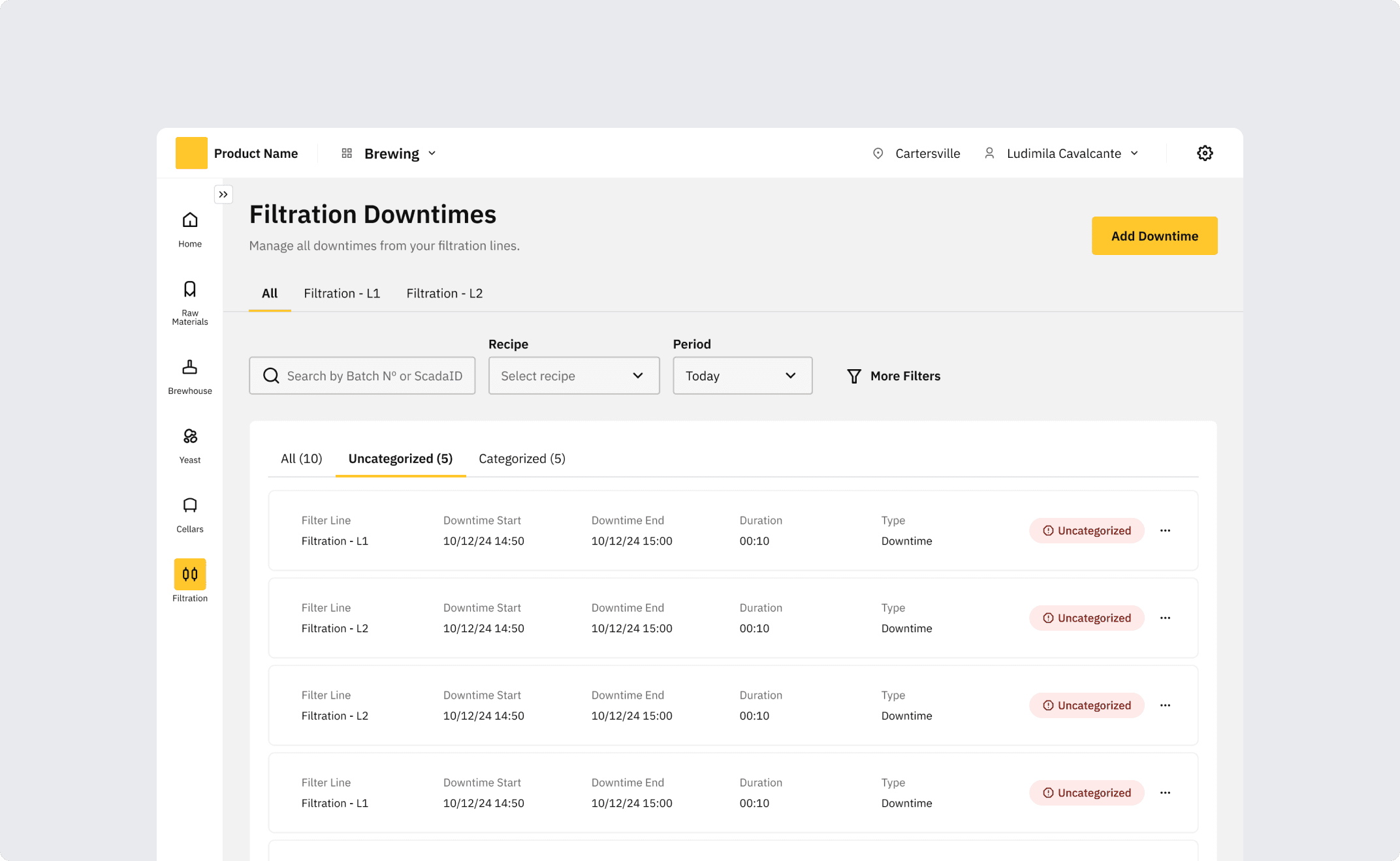
After the navigation was approved, I took on 2 new product contexts (Filtration and Packaging). See how the navigation remained consistent across all of them

THANKS FOR READING